Slider
New to Analytica 6.3
Use this function to create a slider control in a user input node or in an edit table cell.
A slider control has a horizontal track with one or more movable thumbs that are used to select a value, an interval, or multiple values. A slider can be continuous or discrete -- a discrete slider limits the thumb to a finite set of positions. Its Domain specifies the space of selectable values and thus determines whether it is continuous or discrete. A slider can also optionally include labels with tick marks.
Slider( val..., domain, styles, ..., resultIndex, returnRef )
A slider can have one or more thumbs:
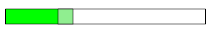
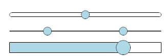
Expression Control's appearance Result after evaluation Slider(0.5)→ 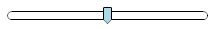
→ 0.5Slider(0.5, 0.75)→ 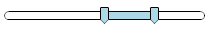
→ [0.5, 0.75]Slider(0.1, 0.5, 0.75)→ 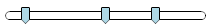
→ [0.1, 0.5, 0.75]
.png)
.png)
.png)
The number of values specified determines the number of thumbs. Notice that it defaults to a Continuous(0,1) scale.
To create a slider user input
- Enter Edit mode
- Drag a new Variable or Decision node to the diagram
- Enter a Title, say:
Probability of Rain - Press
 to edit its Definition
 - Enter its Definition:
Slider(0.5)
- From the the Object menu (or Right-click menu) select Make User Input Node (or press Ctrl+m).
- Drag the user input node to your desired location.
The user input node looks like this:
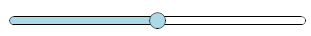
Or if you enter the Definition as Slider(0.5, styles:'LabelsBelow'), it looks like this:

Domain
The domain determines the space of values that can be selected by the slider. When no domain is specified, the slider defaults to Continuous(0,1), which allows any value between 0 and 1 to be selected.
There are two ways to specify the domain for the slider -- you can either use the Domain attribute or the «domain» parameter.
Using the Domain attribute
To change the Domain attribute from the Attribute panel, select Domain on the Attribute menu.  .
.
The Domain-type pulldown has these options:  .
.
Select Continuous if you want a continuous slider and specify the lower and upper bounds.
A discrete slider restricts the thumb(s) to a finite set of positions. You can select either Integer, Explicit Values, or Copy from Index. You can also compute the domain using Expression. Here we illustrate the use of Explicit Values.

Slider('Bad', styles:'LabelsBelow')→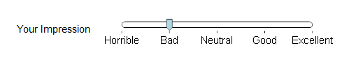

Using the Domain attribute is often (but not always) preferable to using the «domain» parameter since it is more readily available once your UI is displaying the control.
Using the «domain» parameter
As an alternative to using the Domain attribute, your can specify the domain directly as a parameter. If both are specified, the parameter is used. When you pass the domain as a parameter, you must use a name-parameter calling convention. The following examples illustrate how the «domain» parameter is specified.
Slider( 'Good', domain:Discrete('Horrible', 'Bad', 'Neutral', 'Good', 'Excellent') )Slider( 'Good', domain:['Horrible', 'Bad', 'Neutral', 'Good', 'Excellent'] )Slider( 'D', domain: 'A'..'G' )Slider( 23, 54, domain:Continuous(0, 100) )Slider( 4, domain:Integer(1,5) )Slider( 'Medium', domain:LMH){ where LMH is an index name }
Return value
A slider with one thumb returns its first parameter.
Slider(0.7)→ 0.7Slider('C', domain:'A'..'Z')→'C'
A slider with two or more thumbs returns a list of the values
Slider(0.3, 0.7) → [0.3, 0.7]
When you provide a «resultIndex», the result is a 1-D array on that index.
- Index Quantile :=
[10%, 50%, 90%]
Slider(10,30,80, domain:Continuous(0,200), resultIndex: Quantile) → 

If you pass True to the «returnRef» parameter, a reference to the result is returned.
If you have a table of multi-thumb sliders (like interval sliders), then you should return references or use a «resultIndex» for all multi-thumb sliders in the table. Otherwise, each list returned by each multi-thumb slider becomes a separate implicit index, and multiple implicit indexes cannot be combined in the same array.  The use of «returnRef» or «resultIndex» addresses that problem.
Ordering
When a slider has 2 or more thumbs, the default is to constrain the ordering of the thumbs so that the left thumb cannot move past the right thumb. You can change this by using styles:'Unordered' as illustrated here.
Slider( 0.1, 0.2, 0.4, styles: 'Unordered' )
Appearance
There are many options (various styles, colors and track height) that alter the appearance sliders. In most cases, you'll want to adopt a consistent color and style scheme for all sliders in your model. To maintain consistency, you should configure the model-wide defaults and avoid explicitly specifying appearance parameters in the Slider function calls. Use the parameters to adjust parameters when you want a particular slider to deviate from the model-wide defaults.
Model-wide defaults
To control these model-wide defaults, make sure no node is selected, then use the menus to navigate to
- Definition / System variables / Settings / Slider style defaults / Edit table
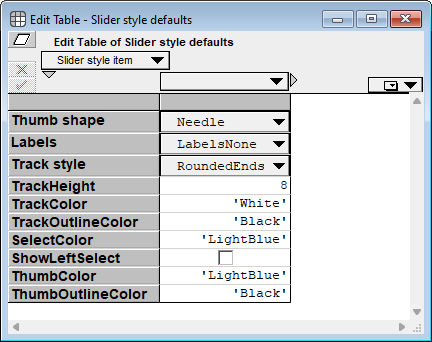

Appearance parameters
The «styles» parameter accepts a comma-separated list of text options, as described in the next subsection. The subsection after that lists the numerous color parameters that you can specify. And finally, «trackHeight» accepts a single positive number, which is the height of the track (in pixels).
«Styles» parameter
The «styles» parameter accepts these options:
'Needle', 'Circle', 'Rectangle', 'Diamond', 'Block', 'Line', 'NoThumb'- The thumb shape.
'RoundedEnds', 'FlatEnds'- The track shape.
'LabelsNone','LabelsBelow','LabelsAtEnds'- Whether and where labels appear.
'ShowSelect','HideSelect'- Whether the area to the left of a single thumb, or between 2 thumbs, uses «selectColor».
'Ordered', 'Unordered'- Whether multiple thumbs can cross over each other.
The options in each group above are mutually exclusive. If you do specify more than one, the one that appears last takes precedence. Multiple styles, one from each each group, can be specified in any order separated by commas, e.g.,
Slider( 0.2, styles: 'Circle','FlatEnds','LabelsAtEnds','ShowSelect') → 
Color parameters
The color parameter names are
trackColortrackOutlineColorselectColorthumbColorthumbOutlineColor
Their meaning is illustrated here.
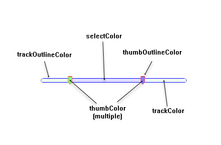

(Depicted is Slider( 0.2, 0.7, styles:'ShowSelect', trackColor:0x1000ff00, selectColor:0x200000ff, thumbColor:0x80ff80,0x8080ff, thumbOutlineColor:'red', trackOutlineColor:'Blue'))
Each color parameter value can be specified using a color integer or a color name as described at Color parameters.
Each of the color parameters (trackColor, trackOutlineColor, selectColor, and thumbOutlineColor), other than thumbColor, accepts a single color only. You can pass one or more colors to the thumbColor parameter, making it possible to have thumbs with different colors.
Slider(0.1,0.3,0.6, thumbColor:'red','white','blue') → 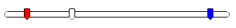 .
.
Thumb shapes
'Needle'
'Circle'
'Rectangle'
'Diamond'
'Block'
- A block thumb looks better when used with a larger track height (shown are trackheight:8 and trackheight:20), and with
style:'FlatEnds'.
'Line'
'NoThumb'
- The NoThumb style needs to show the selection (the
'ShowSelect' style), which it turns on automatically unless you explicitly specify styles:'HideSelect'. We think it also work best with a larger track height (shown are trackheight:8 and trackheight:20), and with style:'FlatEnds'.
Labels
A slider control can appear with no labels (styles:'LabelsNone'), with the min and max label at each end (styles:'LabelsAtEnds'), or with labels below (styles:'LabelsBelow') . These examples illustrate a slider with 'LabelsAtEnds' and two sliders with 'LabelsBelow'.


The bottom user input node has its node style set to have the control on the left.
Track end styles
Use a 'RoundedEnds' or 'FlatEnds' style to control the track shape.
Slider( 0.3, styles:'RoundedEnds' ) → 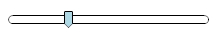
Slider( 0.3, styles:'FlatEnds' ) → 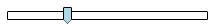
Rounded ends are the out-of-the-box default (although you can change the model-wide default in the Slider style defaults system variable). We think flat ends work better with the 'Block' and 'NoThumb' thumb styles, e.g.,
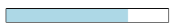
Slider( 0.3, styles:'Block','FlatEnds','ShowLeftSelect', trackHeight:15, selectColor:'Lime',thumbColor:'LightGreen' )
→ 
Track Height
The track height can change the feel of the slider control substantially. The following compares track heights of 8, 1 and 20.

Note that when the track height is set to 1, you can't see the trackColor or selectColor, unless you set trackOutlineColor:'Transparent'. In the second slider above, we see the track outline color.
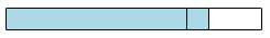
ShowLeftSelect
In the model-wide defaults, the ShowLeftSelect checkbox controls whether the select color appears to the left of the thumb in the case where the slider has one thumb. The select color shows up between thumbs for interval sliders even when this is off. Here we see a slider with this unchecked and then with it checked.

For an interval slider, the model-wide default does not turn off the selection color between the thumbs. This interval slider displays the same regardless of whether ShowLeftSelect is on in the model-wide defaults.
The styles parameter options 'ShowSelect' and 'HideSelect' override the ShowLeftSelect model-wide setting for one-thumb and interval-sliders alike.
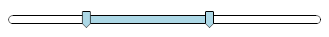
Slider(25,64, styles:'HideSelect') → 
See Also
Enable comment auto-refresher