Difference between revisions of "ACP Style Library"
Davidpaine (talk | contribs) |
Davidpaine (talk | contribs) |
||
| Line 76: | Line 76: | ||
| − | ''' | + | '''Other Navigation Options''' In the top pane of the Navigation style dialog: |
| − | + | ''These next two checkboxes are unusable and so are hidden when you have not selected a tabbed Navigation style.'' | |
| + | *'''Include top level diagram as tab:''' Check to include the top model diagram as the leftmost tab for "Side tabs", or top tab for "Top tabs". If your 'Navigation style' is a '''Tab''' style, you may uncheck this checkbox, if you don't want the main model (top diagram) to be the first tab. It will not display in ACP, so you include the key user interface pages as modules in the main model. This is the default style for single level tabs, and is required for two-level tabs. . [[CloudPlayerStyles_Attribute_Values#Exclude_the_top_level_diagram_from_tabs| More...]] | ||
| − | + | :[[File:Show as tab01.png]] | |
| − | :[[File: | ||
| − | '''Minimum resolution''': The resolution in pixels of the smallest screen that your end users may have. ACP uses a fixed browser window size (canvas) for all Diagrams (tabs), unlike Analytica on the desktop that lets you have a different window size for each one. It's important to select a size that works well for all users, even on laptops with smaller screens. When you select a minimum resolution for the screen, it automatically resizes the main Diagram size in the desktop so that it will work well in ACP. The actual diagram size will be smaller than the screen resolution to allow for space for the web browser controls, menus, and tabs at the top, and window edges and scroll bars that take a little space on the sides and bottom. | + | *'''Show hierarchy''': Lists the titles of the top, ancestor, parent, and current modules to show where you are in a model (see example below). You can click any ancestor to move up the module hierarchy, similar to the [[Show module hierarchy]] in Analytica on the desktop. Note that, to save screen space, the hierarchy does not display when it would be redundant, showing the same information displayed on the top tabs or side tabs, i.e. in the top levels of the model. The hierarchy is not usable with the '''Outline''' style since it duplicates the information on the outline. For the Top diagram only style there is no need for the hierarchy. |
| + | :[[File:Show hierarchy01.png]] | ||
| + | |||
| + | |||
| + | *'''Minimum resolution''': The resolution in pixels of the smallest screen that your end users may have. ACP uses a fixed browser window size (canvas) for all Diagrams (tabs), unlike Analytica on the desktop that lets you have a different window size for each one. It's important to select a size that works well for all users, even on laptops with smaller screens. When you select a minimum resolution for the screen, it automatically resizes the main Diagram size in the desktop so that it will work well in ACP. The actual diagram size will be smaller than the screen resolution to allow for space for the web browser controls, menus, and tabs at the top, and window edges and scroll bars that take a little space on the sides and bottom. | ||
:[[ACP_Diagram_Sizes#Diagram_Size_in_the_ACP_Style_Library|More...]]<br/> | :[[ACP_Diagram_Sizes#Diagram_Size_in_the_ACP_Style_Library|More...]]<br/> | ||
| − | :[[File:Min | + | :[[File:Min res01.png]] |
===ACP Navigation options=== | ===ACP Navigation options=== | ||
| − | In this bottom section of the ACP Navigation styles, you can control how the banner area above your diagram appears. | + | In this bottom section of the ACP Navigation styles, you can control how the banner area above your diagram appears and whether or not to add scroll bars. To simplify the process of setting the styles, these checkboxes are hidden if you have selected an incompatible Navigation style in the top pane. |
| − | :[[File:Navigation | + | :[[File:Navigation checkboxes01.png]] |
====Banner logo and tabs==== | ====Banner logo and tabs==== | ||
Unchecking the 'Banner logo and tabs' hides the banner space usually present at the top of ACP. The banner typically contains the Lumina Logo, the '''Parent Diagram''' button, tabs, '''Close Model''' button, and '''Save''' button. | Unchecking the 'Banner logo and tabs' hides the banner space usually present at the top of ACP. The banner typically contains the Lumina Logo, the '''Parent Diagram''' button, tabs, '''Close Model''' button, and '''Save''' button. | ||
| Line 101: | Line 105: | ||
====Parent button==== | ====Parent button==== | ||
| − | Flag to control the display of the '''Go into Parent''' button. Currently the button is shown by default. | + | Flag to control the display of the '''Go into Parent''' button. Currently the button is shown by default with Outline style. The checkbox is hidden in other styles. It is possible to display this button with top tabs, but not by using the styles library, since there are some model specific settings involved. [[CloudPlayerStyles_Attribute_Values#Go_into_Parent_Button Not compatible with Side tabs. | More...]] |
:[[File:Styles library 17.png]] | :[[File:Styles library 17.png]] | ||
| Line 107: | Line 111: | ||
====Toolbar tabs==== | ====Toolbar tabs==== | ||
| − | By clearing this checkbox, you can remove the default ACP tabs that appear at the top of ACP. These are the tabs with titles like "Diagram", "Object", "Edit Table", "Table", "Graph"... Toolbar tabs are | + | By clearing this checkbox, you can remove the default ACP tabs that appear at the top of ACP. These are the tabs with titles like "Diagram", "Object", "Edit Table", "Table", "Graph"... Toolbar tabs are compatible only with 'Outline' style. |
:[[File:Styles library 18.png]] | :[[File:Styles library 18.png]] | ||
====Use Top diagram size for all windows==== | ====Use Top diagram size for all windows==== | ||
| − | Sets the size of all diagrams based on the size of the diagram window of the top level when the model was last viewed in Desktop Analytica (in non-maximized mode). This is | + | Sets the size of all diagrams based on the size of the diagram window of the top level when the model was last viewed in Desktop Analytica (in non-maximized mode). This is mandatory in all but 'Outline' style. |
====Model title==== | ====Model title==== | ||
| Line 120: | Line 124: | ||
===Diagram title=== | ===Diagram title=== | ||
| − | You can control whether or not to display the diagram's title at the top of the diagram. | + | You can control whether or not to display the diagram's title at the top of the diagram. Only usable with 'Outline' style. |
:[[file:styles library 20.png]] | :[[file:styles library 20.png]] | ||
| Line 127: | Line 131: | ||
Checking this causes ACP to calculate any result (table or graph) as it displays a diagram window containing the result, and to immediately recalculate any result when the user changes an input on that diagram that affects the result. (It combines Calculate on open and Auto recalc results.) This behavior is unlike Analytica which does not usually calculate results until the user asks for them by clicking the Calc button. | Checking this causes ACP to calculate any result (table or graph) as it displays a diagram window containing the result, and to immediately recalculate any result when the user changes an input on that diagram that affects the result. (It combines Calculate on open and Auto recalc results.) This behavior is unlike Analytica which does not usually calculate results until the user asks for them by clicking the Calc button. | ||
| − | '''Once you have the navigation styles set the way you want, click ''' | + | ====Add Scroll bars==== |
| + | When checked, ACP adds scroll bars if needed to be able to see the entire diagram. When unchecked, the diagram will be either the top diagram size if this flag is set, or the canvas size. | ||
| + | |||
| + | '''Once you have the navigation styles set the way you want, click '''Close'''. This will close the Navigation panel and take you back to the Main ACP Style Library diagram. ''' | ||
| − | :[[File: | + | :[[File:CloseNavstyles01.png]] |
==Node styles== | ==Node styles== | ||
Revision as of 04:21, 31 May 2018
The Analytica Cloud Player (ACP) offers a variety of user-interface styles and features useful for web applications, and not available in desktop Analytica. These include navigation styles with tabs across the top or down the left side, node styles, and Frame nodes to show tables and graphs embedded in a Diagram. The ACP Style Library helps you select these user-interface styles and options in Analytica on the desktop. You could specify these styles by setting flags and codes in the CloudPlayerStyles attributes of the model. But it's much easier just to use the ACP Style library. That way you don't have to learn these special codes.
You can see a video of the ACP Style library in use in the Analytica Cloud Player (ACP) Webinar.
How to install the ACP Style library
The simplest way to add the ACP Style library is to load it from the standard Analytica libraries:
You can also download the latest version of the ACP style library from here: Media:ACP style library.ana, which includes some more recent enhancements to ACP.
- Make sure you are in edit mode.
- Click File menu > Add Library...
- The file explorer lists the standard Libraries installed. Select ACP Style Library.ANA and click Open:
It adds the 'ACP Style library' to the diagram:
How to use the ACP Style library
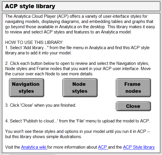
After installing the library into your model, double-click the ACP Style library node to view its main control panel:
Click one of these buttons to open a dialog to select those styles and options:
- #Navigation styles: For tab styles, expandable module outline, window size, and other options to navigate the model in ACP.
- #Node styles:For styles to display nodes, balloon help.
- #Frame nodes: To select text nodes that display edit and result tables and graphs embedded in a user-interface diagram.
See below for details on each dialog.
Set ACP styles in Analytica, and view them in ACP
You use the ACP Style library to set styles in Analytica on the desktop, but you can only see their effect in ACP. (The ACP Style library does show some examples of what the styles look like.) After setting some ACP styles, you can see their full effect by uploading your model into ACP. You can do this quickly by selecting Publish to cloud... from the File menu. It lets you upload and run the model in your free individual ACP account, or in an ACP Group account if you have one.
The library is invisible in ACP. Once you have selected the ACP styles you want, you can delete the ACP Styles Library from your model. Your selections model will remain. Tthe library file size is over 1 MB, so removing it from your model saves a little time when uploading and running the model in ACP.
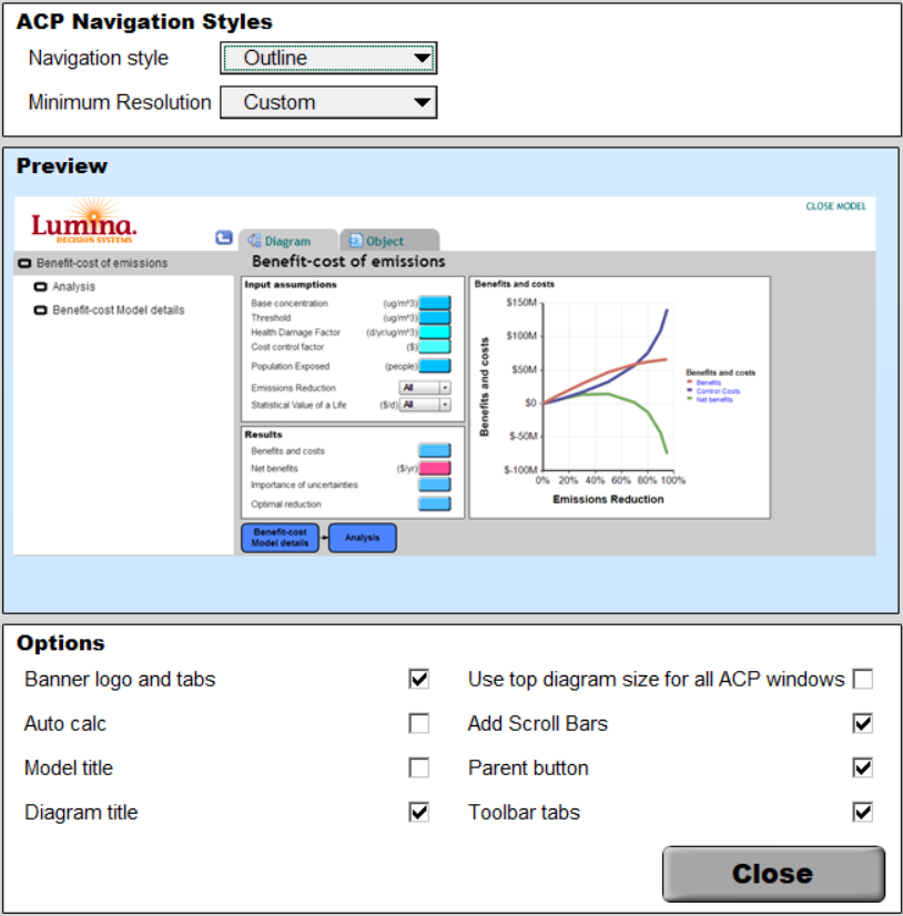
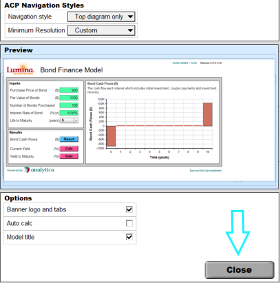
This dialog lets you configure the navigation style using the outline view, hierarchy header as in Analytica, or tabs across the top or down the left. You can also control the display of some elements such as those in the banner shown above the diagram. Click the Navigation styles button to get started.
The Navigation styles dialogue window opens...
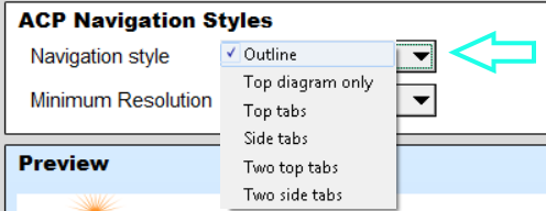
The Navigation style pulldown menu selects ways to navigate the model: The Preview pane beneath the menus shows an example ACP interface with the options you have selected:
The Navigation style options are:
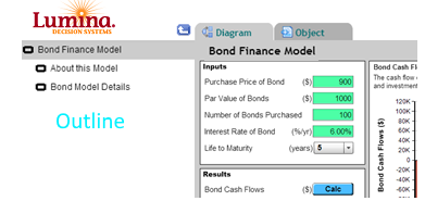
- Outline: With an expandable module hierarchy (see example below) that lets you quickly find the module you want to see, similar to the Outline window in Analytica on the desktop.
- Top diagram only: Shows in ACP as a single diagram, with no Outline or hierarchy or tabs. This is useful when creating a simple Web application with a single UI, and no need for any navigation. You need to arrange, and size the diagram to display what you want users to see in ACP.
Tabbed Navigation styles: These show the main modules in your top model as tabs (ordered left to right then top to bottom). It is most useful for creating a web application for people not familiar with Analytica. It works best when you create a few modules at the top level with user inputs and outputs, showing input tables and result tables and charts in #Frame nodes. The Navigation style menu offers these options:
Single level tabs:
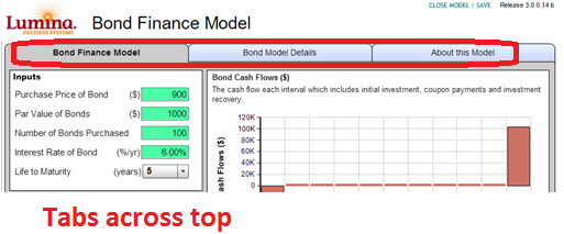
- Top tabs: Display the tabs left to right across the top of the diagram. For example:
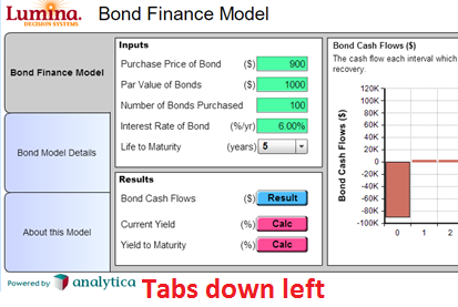
- Side tabs: Display the tabs in a column on the left of the diagram. For example:
Two-level hierarchical tabs : Modules in the main model appear as top tabs (left tabs). Modules in those top level modules appear as subtabs. When you select a top-level tab, it shows its submodules as subtabs.
- Two top tabs
- Two side tabs
Other Navigation Options In the top pane of the Navigation style dialog:
These next two checkboxes are unusable and so are hidden when you have not selected a tabbed Navigation style.
- Include top level diagram as tab: Check to include the top model diagram as the leftmost tab for "Side tabs", or top tab for "Top tabs". If your 'Navigation style' is a Tab style, you may uncheck this checkbox, if you don't want the main model (top diagram) to be the first tab. It will not display in ACP, so you include the key user interface pages as modules in the main model. This is the default style for single level tabs, and is required for two-level tabs. . More...
- Show hierarchy: Lists the titles of the top, ancestor, parent, and current modules to show where you are in a model (see example below). You can click any ancestor to move up the module hierarchy, similar to the Show module hierarchy in Analytica on the desktop. Note that, to save screen space, the hierarchy does not display when it would be redundant, showing the same information displayed on the top tabs or side tabs, i.e. in the top levels of the model. The hierarchy is not usable with the Outline style since it duplicates the information on the outline. For the Top diagram only style there is no need for the hierarchy.
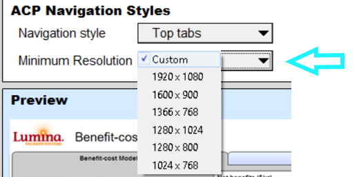
- Minimum resolution: The resolution in pixels of the smallest screen that your end users may have. ACP uses a fixed browser window size (canvas) for all Diagrams (tabs), unlike Analytica on the desktop that lets you have a different window size for each one. It's important to select a size that works well for all users, even on laptops with smaller screens. When you select a minimum resolution for the screen, it automatically resizes the main Diagram size in the desktop so that it will work well in ACP. The actual diagram size will be smaller than the screen resolution to allow for space for the web browser controls, menus, and tabs at the top, and window edges and scroll bars that take a little space on the sides and bottom.
In this bottom section of the ACP Navigation styles, you can control how the banner area above your diagram appears and whether or not to add scroll bars. To simplify the process of setting the styles, these checkboxes are hidden if you have selected an incompatible Navigation style in the top pane.
Banner logo and tabs
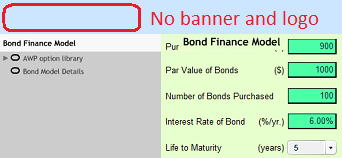
Unchecking the 'Banner logo and tabs' hides the banner space usually present at the top of ACP. The banner typically contains the Lumina Logo, the Parent Diagram button, tabs, Close Model button, and Save button.
Parent button
Flag to control the display of the Go into Parent button. Currently the button is shown by default with Outline style. The checkbox is hidden in other styles. It is possible to display this button with top tabs, but not by using the styles library, since there are some model specific settings involved. More...
Toolbar tabs
By clearing this checkbox, you can remove the default ACP tabs that appear at the top of ACP. These are the tabs with titles like "Diagram", "Object", "Edit Table", "Table", "Graph"... Toolbar tabs are compatible only with 'Outline' style.
Use Top diagram size for all windows
Sets the size of all diagrams based on the size of the diagram window of the top level when the model was last viewed in Desktop Analytica (in non-maximized mode). This is mandatory in all but 'Outline' style.
Model title
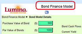
Shows the title of the model at the top to the right of the Lumina (or other) logo. Note this flag only works properly when you also clear Toolbar tabs because the tabs and title will overlap.
Diagram title
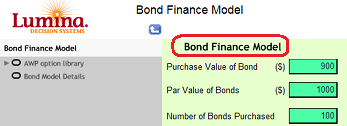
You can control whether or not to display the diagram's title at the top of the diagram. Only usable with 'Outline' style.
Auto calc
Checking this causes ACP to calculate any result (table or graph) as it displays a diagram window containing the result, and to immediately recalculate any result when the user changes an input on that diagram that affects the result. (It combines Calculate on open and Auto recalc results.) This behavior is unlike Analytica which does not usually calculate results until the user asks for them by clicking the Calc button.
Add Scroll bars
When checked, ACP adds scroll bars if needed to be able to see the entire diagram. When unchecked, the diagram will be either the top diagram size if this flag is set, or the canvas size.
Once you have the navigation styles set the way you want, click Close. This will close the Navigation panel and take you back to the Main ACP Style Library diagram.
Node styles
The Node styles dialog lets you configure how nodes are displayed including bevels and shadows. You can specify the style for highlighting when you move the mouse over a node, and whether to show balloon help with a description for each node.
Node effect on mouse-over
Select a highlighting effect for nodes when you move the cursor over the node. The default setting is 'Outline', with 'Glow' and 'None' as the other choices. As you select an effect from the pulldown menu a preview is shown.
Node edge appearance
In this pane, the 2 checkboxes set flags controlling the appearance of the edge of the nodes. Bevels adds a 3 d bevel to the node. Shadows adds a drop shadow effect. You can select either of these effects or both.
Balloon help
This pane has two checkboxes to set whether the identifier and/or the definition is also shown in the balloon, and a pulldown menu which sets the delay before a balloon appears.
By default, ACP displays the description - if any - the units, and the title of an object in a balloon as you place the mouse over it. If there is no description the balloon will not appear.
Identifier in balloon. This can be useful when a node is titled 'Net present value' and has an identifier Npv for example.
Definition in balloon. When checked, it shows the Definition of a variable in the balloon when you move the mouse cursor over its node.
Both Definition and Identifier boxes checked
Balloon delay When you mouse over a node, there's a short delay of about half a second before it displays the balloon (to prevent wild balloon appearance when you move the cursor rapidly over a diagram.) You can tweak this delay time measured in seconds.
Uncertainty icon in outputs
Analytica normally shows, just to the right of an output node, a little icon indicating the uncertainty view last displayed e.g. mid, mean, ProbBands, pdf ...
You can suppress these icons. This might be desirable, for instance, if your model is not probabilistic.
Flash buttons
For button nodes, instead of drawing a button that looks like a button node in desktop Analytica, use a Flash button. A Flash button component looks and feels a little bit more like a GUI button used in software applications.
If you are building a web application which uses Submit or other buttons, you might find it looks better using the Flash button component rather than a traditional Analytica button node.
However, if you are using multi-line text or have images embedded in any of the button nodes, then you should not use Flash Buttons since they don't support these features.
*Once you have the Node styles set remember to click 'done'. This will apply the node style attributes you have selected to the model and return you to the ACP Style Library diagram
Frame nodes
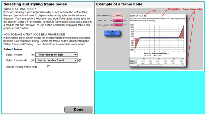
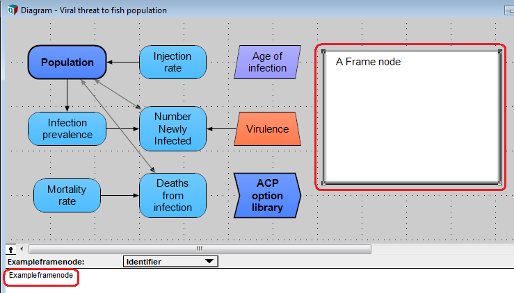
What is a frame node? If you are creating a Web Application which does not use the toolbar tabs, then you probably will want to display tables and graphs on the influence diagram. You can specify the location and size of the tables and graphs on the diagram using a Frame node. A module frame node is just a text node in a module that one tells ACP to use as the location for displaying tables and graphs in that module.
These are used with Web Application navigation styles where the toolbar tabs are not present. If you are not using one of the Web Application navigation styles, then you can skip this step.
How to make a text node be a frame node
First, create a text node in the module you want to display tables and graphs. Here is a Model with a text node on the top diagram.
Select frame
- In the Frame Nodes control panel, select the module where the text node is located from the 'Select module' pulldown menu.
- Select the frame node's identifier from the 'Select frame node' pulldown menu.
(If the text node is newly added to the model, it may not be listed if this variable has not been 'dirtied'. If it is not listed, you need to click the refresh button.)
- Once you have the correct node selected, then check "Use as a module frame node".
Once you check this checkbox the options in the field below will be displayed and enabled..
Select frame node styles
Index Menus Controls the display of the Index pulldown menus on the diagram. Unchecked by default, since this saves diagram space, and it is assumed that a modeller will usually choose how he wants people to view the orientation and dimensions of a table/graph in his model on the web. If you want people to be able to view and use these menus in ACP, check this box.
Title This checkbox controls whether or not the title of the node is shown above the table or graph on the diagram.
Description This checkbox controls whether or not the description of the node is shown above the table or graph on the diagram.
Description length Length of description of variable as a percent of Frame height. Not enabled if the 'description' check box is unchecked. If the Description is too long to fit the allotted space, it will be truncated and a scroll bar will be used to view the entire description. (This feature will only display correctly if you have made the frame node large enough to accommodate the scroll bar within the allotted space).
Table and or graph When the results of a node are shown, you have the following options, to show just the graph, just the table, show both the table and the graph. If you want the table or graph to be shown based on what was viewed last in Analytica, you can choose 'As saved in Analytica'.
For edit tables, the table will always be displayed regardless of this setting.
Once you have chosen the settings for your frame node, you can make another frame node, either in a different module or in the same module. If there is more than one Frame, each time you click on a node, it will show its table or graph in the Frame whose contents was displayed the longest ago. Thus, as you click on different nodes, it cycles through the Frames. In this way, you can see and compare edit tables or results from multiple nodes -- all in the same diagram window.
Click Done when your settings are complete.












Enable comment auto-refresher