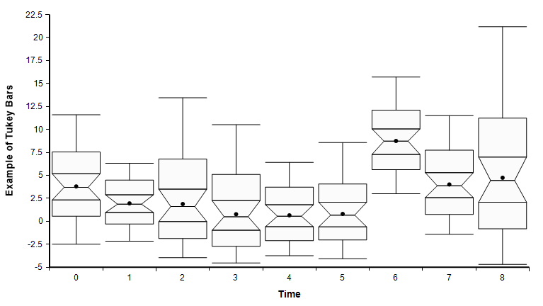
Plot Tukey bars
New to Analytica 5.2
Use this function from OnGraphDraw to plot Tukey bands.

Plot_Tukey_bars(canv, info, roles, showMean)
Draws Tukey-bars on a graph that has a categorical X-axis and is displaying a probability bands graph.
To use, set the OnGraphDraw attribute to:
continue := Plot_Tukey_bars( canv, info, roles, showMean:true )
And set the flags for OnGraphDraw to "after axes, before data". You don't have to include the showMean:true option, but when you do, the mean is also shown as a dot on the graph.
To see the Tukey bars, view the Bands result view. Set Key to None and then set the .Probability slicer to «All», which eliminates the key. It is better without the key since the colors displayed in the key don't apply to this depiction of the data.
Library
To use this function ,you must add the OnGraphDraw annotations.ana library to your model.
- Use File → Add Library... to add this library.
If it doesn't display
If you followed the above instructions and it is not displaying a Tukey plot, it most likely means that your graph setup is not consistent with a tukey bar chart. Make sure:
- You have an X-axis index (that indexes the bars), and that this index is categorical (i.e., not continuous).
- You are viewing the Bands view.
- You checked "after axes, before data".
- The Y axis role is depicting your main variable.
A situation can arise in which the graphing engine thinks your bar index is continuous. It may, for example, be defined as 1..n, but because these are numbers, the graphing engine defaults to a continuous axis. The fix for this is to go into the Graph Setup dialog, Axes ranges tab and check the Categorical box for the axis. Then click Apply.
Enable comment auto-refresher