Box Plots
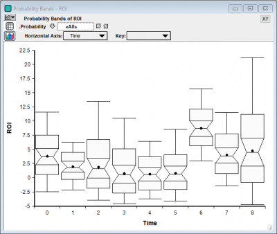
You can create box-whisker plots using the OnGraphDraw attribute and the set of relevant drawing functions. The following is an example of a box-whisker plot created using the new functionality:

Users of previous versions may use probability bands, as described below, to communicate similar information.
A classical box-whisker plot is one that looks like this:
The whisker-ends usually represent either the min and max range of data, or the 10% and 90% fractiles. The top and bottom of the box denotes the 25% and 75% quartiles, with the middle line being the median.
Analytica's probability bands graph is used to depict the same type information, but in a different format:
As a substitute for a box-whisker plot, you can consider a "box-box-box plot":
Or, in the other direction, a whisker-whisker-whisker plot:
While the topmost box-whisker plot is not currently available in Analytica 4.4, all three of the other variations are possible using Analytica's graphing engine. All three plots depict the same information.
The examples in this article are contained in the Box-like-plots.ana model, which you can download and play with.
Probability Bands Plot
The probability bands plot is immediate in the result view when viewing an uncertain quantity that has at least one other dimension (usually a time dimension). Just select the ProbBands view in the top-left corner of the result view.
Box-Box-Box plots
To obtain a box-box-box plot, select a ProbBands result view, then double click to change the chart type settings. Select a bar chart, check the "Variable origin", and uncheck "Swap horizontal and vertical".
Next, press Ctrl+U (Uncertainty Setup dialog) and select the probability levels of interest:
Finally, ensure your horizontal axis is your time index, Key is Probability, and then for Bar Origin select Probability = 0 (or your lowest selected fractile):
Whisker-Whisker-Whisker plots
The Whisker-whisker-whisker plot is sometimes a little tricky to get right. Once again, display the ProbBands view. You must add your Time in as a comparison index, even though it already appears as a pivoter index. This enables the use of an XY graph with more flexible control over which series of points are connected by lines (the running index).
You need to use a line-symbol chart type, and select Use Separate color / symbol keys:
With this, you can now pivot as shown in the next final image to obtain the final graph:


Enable comment auto-refresher