Making a Multi-D Scatter Plot
In this tutorial example, we'll plot the points from a 4-D Gaussian distribution as a scatter plot. You will learn how to set up a scatter plot when the coordinates of the data are organized as columns in a single table, and how such plots can be interactively pivoted to view the scatter points from each dimension.
First, let's create the data to be plotted. For this, we'll define a 4-D gaussian distribution. Follow these steps:
1. Start with a fresh model.
2. In the model's object window, fill in the title and description.
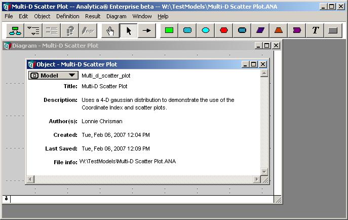
3. Close the object window.
4. Select File->Add Library... -> Multivariate Distributions.ana
5. Create these two indexes:
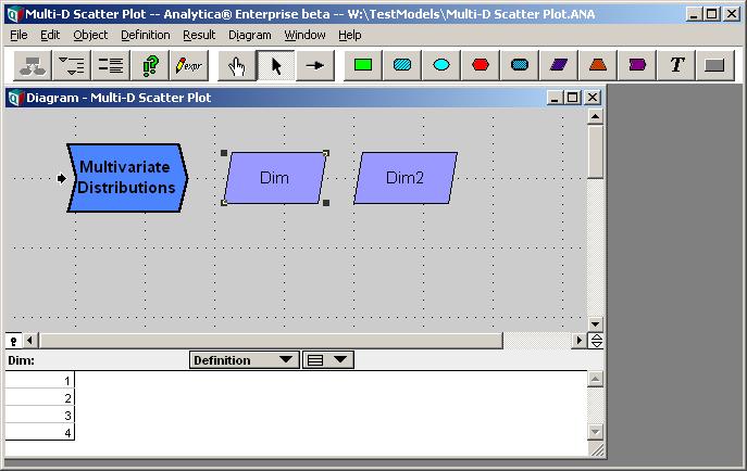
Index Dim := [1,2,3,4]
Index Dim2 := CopyIndex(Dim)
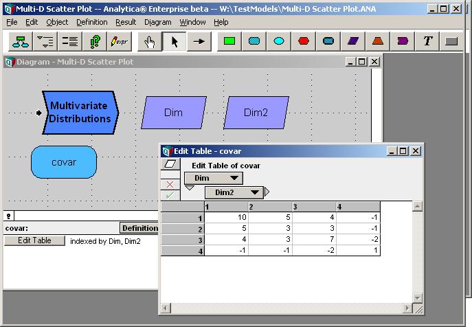
7. Define the covariance matrix. Create a variable named covar and set the definition type to Table. Select the Dim and Dim2 indexes and fill in the edit table with a covariance matrix:
8. Define the Gaussian distribution. Create a chance variable node named X and set the definition to:
Gaussian( 0, covar, Dim, Dim2 )
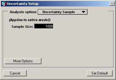
9. Select Result-> Uncertainty Options... and set the sample size to 1000. (so we have more points on our plot)
10. Select X and show Result->Sample. Switch to graph mode if not already.
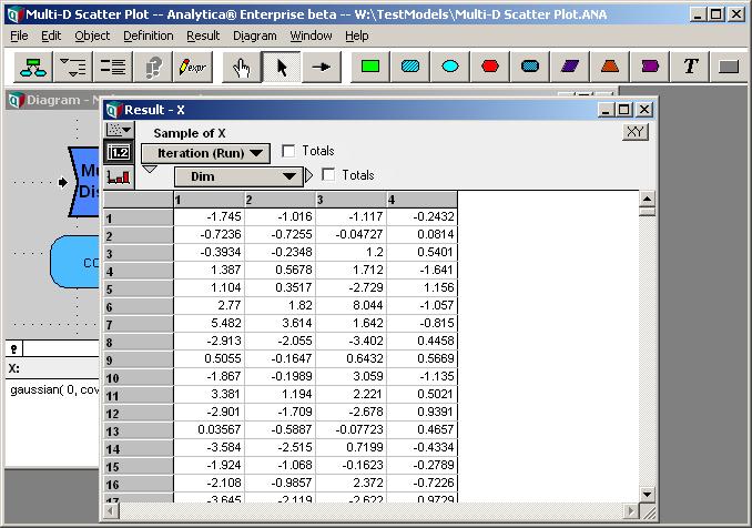
11. Switch to table view to examine the actual data. For convenience, pivot so that Index Dim forms the columns, Run the rows.
Setting the Coordinate Index
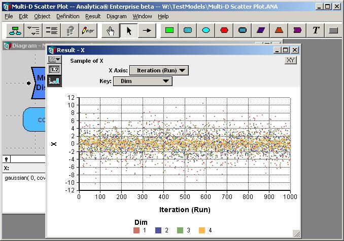
In the initial plot, Analytica treats the data as four series. What we desire is to treat each row in the above table as a single data point to be plotted. Each point is four-dimensional. Of course, on a 2-D graph, with just an X and Y axis, we will be viewing two coordinates at a time, but we can interactively pivot between the various combinations.
In order to use the columns of the data as the coordinates of each data point, we need to tell Analytica that the Dim index is to be interpreted as the Coordinate Index.
11. Press the ![]() at the top-right corner of the result window. In the dialog, select "Use Coordinate Index".
at the top-right corner of the result window. In the dialog, select "Use Coordinate Index".
12. Close the dialog by pressing ![]()
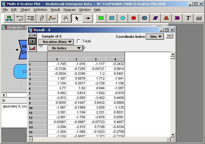
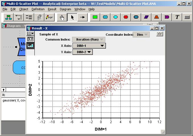
There are a few things to notice about the result window now. A coordinate index pulldown appears at the top. Here we see that Analytica is using the Dim index as the coordinate index, as we desire. The horizontal dimension of the table is now "No Index", and the top row of the column headers is blank. The values of Dim are now appears in the second row of column headers. This indicates that Analytica is treating these as four different values (for graphing, these are value dimensions) all sharing a common index (Run). As different values, they can be plotted relationally against each other.
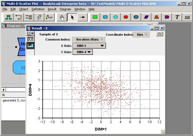
13. Push ![]() to switch to graph mode. Now we have our first scatter plot.
to switch to graph mode. Now we have our first scatter plot.
14. Change the Y-Axis pivoter to Dim=2. This shows us another 2-D projection of the same 4-D scatter data. Spend some time selecting different combinations of X-axis and Y-axis values.


Enable comment auto-refresher