Customization of Graph Colors
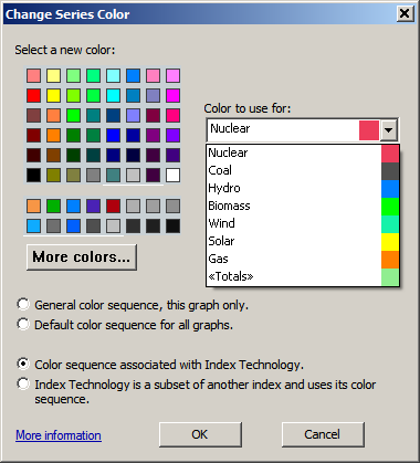
You can change the color used for a data point, curve or bar on a graph by right clicking on it in the graph, or on its corresponding item in the key, and selecting Change Series Color... on the right-mouse context menu. This brings up the following dialog.
Select a new color and press OK and the color far that data series will use the new color.
Designing a Color Series
new to Analytica 4.5.
From the Change Color Series dialog, you can view the current series of colors using the dropdown.
Along the right edge, you can see the current sequence of colors. The labels for your current color dimension display, allowing you to see which color is used for each label. You can select a label, select a new color for it on the left, then select another label and repeat. Once you have the series as you like it, press OK.


Enable comment auto-refresher