Difference between revisions of "ACP Style Library"
Davidpaine (talk | contribs) |
Davidpaine (talk | contribs) |
||
| Line 37: | Line 37: | ||
In this part of the style library you configure how nodes are displayed including using beveling and shadows. As well as what happens when one places the mouse over a node in terms of the mouse over effect and if balloon help will be shown. | In this part of the style library you configure how nodes are displayed including using beveling and shadows. As well as what happens when one places the mouse over a node in terms of the mouse over effect and if balloon help will be shown. | ||
| + | |||
| + | |||
| + | [[File:Styles library 07.png]] | ||
=Frame nodes= | =Frame nodes= | ||
Revision as of 03:22, 26 September 2011
CloudPlayerStyles Attribute Values
ACP Styles Library
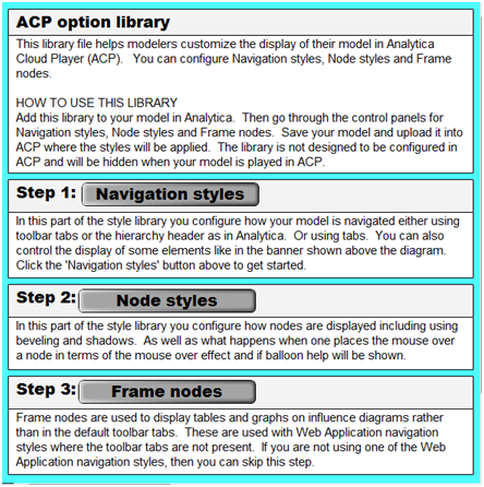
This library file helps modelers customize the display of their model in Analytica Cloud Player (ACP). Most of the ACP styles attributes can be applied using this library, and It simplifies the process by using a GUI rather than by manually typing in the attributes. The library has previews for many of the attributes to give you a better idea of what the model will look like played in ACP. You can configure Navigation styles, Node styles and Frame nodes.
HOW TO USE THIS LIBRARY
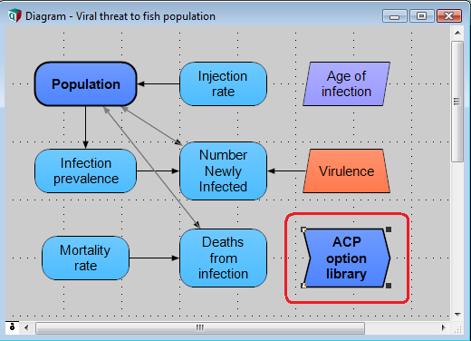
Add this library to your model in Analytica. The 'ACP options library' function node will be added to the model diagram.
Open the ACP styles library by double clicking on it in browse mode.
Then go through the control panels for Navigation styles, Node styles and Frame nodes. Once the attributes have been selected, save your model and upload it into ACP where the styles will be applied. The library is not designed to be configured in ACP and will be hidden when your model is played in ACP.
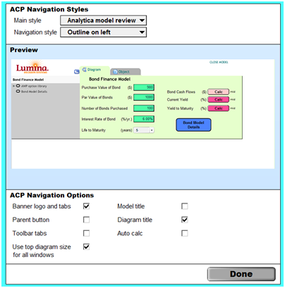
In this part of the style library you configure how your model is navigated either using toolbar tabs or the hierarchy header as in Analytica. Or using tabs. You can also control the display of some elements like in the banner shown above the diagram. Click the 'Navigation styles' button to get started.
The Navigation styles dialogue window opens...
Node styles
In this part of the style library you configure how nodes are displayed including using beveling and shadows. As well as what happens when one places the mouse over a node in terms of the mouse over effect and if balloon help will be shown.
Frame nodes
Frame nodes are used to display tables and graphs on influence diagrams rather than in the default toolbar tabs. These are used with Web Application navigation styles where the toolbar tabs are not present. If you are not using one of the Web Application navigation styles, then you can skip this step.


Enable comment auto-refresher