Difference between revisions of "AcpStyles"
Davidpaine (talk | contribs) |
|||
| Line 25: | Line 25: | ||
[[Image:ACP Outline Tree.png]] | [[Image:ACP Outline Tree.png]] | ||
| − | ==== | + | ====Hierarchy Header==== |
ACP will display the model hierarchy in a bar at the top of the diagram making it easy to see where you are located in the model structure. You can also easily navigate to the modules above the current module by clicking on their label in the Hierarchy Header. Another benefit of the Hierarchy Header is that it doesn't take up as much screen real estate as the Outline Tree. | ACP will display the model hierarchy in a bar at the top of the diagram making it easy to see where you are located in the model structure. You can also easily navigate to the modules above the current module by clicking on their label in the Hierarchy Header. Another benefit of the Hierarchy Header is that it doesn't take up as much screen real estate as the Outline Tree. | ||
Revision as of 03:07, 25 August 2011
CloudPlayerStyles
ACP offers several options for controlling how the user interface looks and works. You control most of these options by setting flags in CloudPlayerStyles for the main model. You can set a few using CloudPlayerStyles for specific variables or nodes.
Note in Analytica, the CloudPlayerStyles attribute is always visible in the Attribute Panel and is not present by default in the the Object window. So the Attribute Panel is a good place to add the CloudPlayerStyle settings. If you are using Analytica 4.3 or earlier, the attribute will appear as Awp_attrib instead. The attribute was renamed to CloudPlayerStyles in Analytica 4.4.
To add multiple flags in CloudPlayerStyles, you can separate them with commas or spaces, or whatever you prefer. ACP just looks for the particular text values and doesn't care about the delimiter. (Personally, I prefer to separate multiple multiple flags by putting each one on a separate line.)
Most of the CloudPlayerStyles can be set using a graphic user interface by inserting ACP Style Library into your model, and then following the ACP Style Library instructions. Then the Style Library will set the appropriate CloudPlayerStyle settings in the model for you. Using the ACP Style Library is the recommended way of setting up model level CloupPlayerStyles including Navigation Style, Node Styles and Frame Node Styles. Node level CloudPlayerStyles still need to be manually by inserting settings discussed below into the CloudPlayerStyles attribute.
Model level settings
For these options, insert each flag in the CloudPlayerStyles of the object window of the Main Model. (So far, ACP does not support CloudPlayerStyles in submodules. We may add module-specific options later.)
Outline Tree
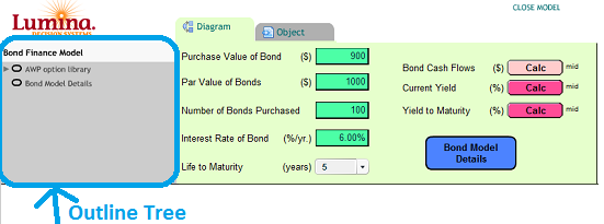
By default, ACP shows an expandable outline tree of modules on the left hand side of the window. This makes it easy to navigate around a model with many modules.
For small models, and most cloud apps, you may want to suppress this. You can configure ACP not to show the Outline Tree by inserting the text show_outline:no into the top model's CloudPlayerStyles attribute to prevent ACP from displaying the Outline Tree. (If a model has only one diagram i.e. the model has no modules, the outline tree never shows.)
Hierarchy Header
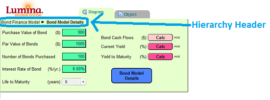
ACP will display the model hierarchy in a bar at the top of the diagram making it easy to see where you are located in the model structure. You can also easily navigate to the modules above the current module by clicking on their label in the Hierarchy Header. Another benefit of the Hierarchy Header is that it doesn't take up as much screen real estate as the Outline Tree.
Note that this setting is not based on an AnalyticaCloudPlayer styles attribute, but rather on the 'Show module hierarchy' check box in the model Preferences in Analytica. With the model opened in Analytica, on the Edit menu, select Preference..., and you will see 'Show module hierarchy' check box.
Toolbar Tabs
- show_tabs:no - By default, ACP shows navigation tabs for "Diagram", "Object", "Table", "Chart" along the top. Use this flag to hide those tabs. If you display the model inputs and outputs on the diagram -- using embedded tables and graphs on the diagram -- your users may not need those tabs. (You can also use show_tabs:yes to explicitly show the tabs.)
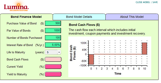
Using the Navigation_style CloudPlayerStyle setting, you can configure ACP to use 'Tabs across the top' (i.e. top tabs) or 'Tabs along the sides' (i.e. side tabs). In this case, the tabs display different influence diagrams. The first tab displays the top level diagram, and the remaining tabs display the modules present on the top level diagram of the model.
- navigation_style:top_tabs - This setting instructs ACP to use the 'Tabs across the top' navigation style.
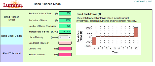
- navigation_style:side_tabs - This setting instructs ACP to use the 'Tabs along the side' navigation style. Side tabs work better than top tabs when there more module nodes present.
The top level diagram is always the first tab. The order of the other tabs is determined the location of the modules on the top level diagram from left to right. The color of the tabs matches the color of the background of the influence diagram it displays. more...
Display Only a Single Diagram
- top_diagram_only:yes - Use this flag if you want to restrict users access to only the top diagram. With this flag, any action that would normally bring up a different diagram will just reload the top diagram. (If you are using this setting, you will also want to also not display the Outline Tree as explained above.)
Go into Parent Button
There are two flags for configuring the Go into Parent button (shown below). One for suppressing its display, and another for changing its location.
- show_parent_diagram_button:no - Flag to control the display of the 'Go into Parent' button. Currently the button is shown by default.
- parent_diagram_button_coordinates:x,y if you want to change the location of the button 'Go into Parent' you can use this flag. E.g. parent_diagram_button_coordinates:10,100 will change the position of this button to x=10, and y=100. These coordinates are measured from the top left hand corner of the window.
- show_diagram_title:no - You can control whether or not to display the diagram's title at the top of the diagram. Use show_diagram_title:no to suppress the diagram title. You can also explicitly tell ACP to show the diagram title by using show_diagram_title:yes, but this is not really necessary because the currently ACP shows the diagram title by default.
Style for diagram nodes
- Show_unc_view_in_outputs:no - In Desktop Analytica, each user output node has a little icon on the right-hand side showing the uncertainty view last viewed (e.g. mid, mean, stats...). In ACP, you can suppress these with the flag Show_unc_view_in_outputs:No. We recommend this for ACP since the icon is usually confusing to end users.
- calc_on_open:yes - By default, ACP, like Analytica, does not compute results when you first view a diagram, leaving any User output nodes showing the "Calc" button. The user must click on each to see its result, as a scalar embedded in the Diagram, or as a separate Result window. Unless some results take a long time to evaluate, it is usually friendlier to compute the values before showing the Diagram. You can make this happen by inserting calc_on_open:yes into CloudPlayerStyles
- show_hover_highlight:no- Usually, ACP displays a hover highlight -- a contrasting light rectangle behind a node -- when you move the cursor over the node. You can suppress this by including the Show_hover_highlight:no. (The hover highlight is different from the hover balloon described below.)
- show_copy_table_icon:no - Usually, ACP displays a copy table icon near the upper right hand corner of a result table (or edit table, but less useful here). Clicking the icon copies the table as displayed so it can be pasted into another place, e.g. Excel. If you don't want hide this icon, this is the flag to use. The Copy Table Icon is the icon shown in the image below.
Hover Balloon
When you move the cursor over a node, ACP usually shows a "balloon" popup next to the node with the title and description of the node (if it has one) to help end users understand what its for, or what to enter for a user input. If the node has no description, the hover balloon will not appear.
- show_id_in_balloon:yes - Use this flag to show each node's identifier below its title in the balloon -- unless the identifier and title are identical (except for spaces which are replaced by underscores).
- show_definition_in_balloon:yes - Use this flag to show the node's definition in the balloon below the description.
- hover_balloon_delay - When you mouse over a node, there's a short delay of about half a second before it displays the balloon (to prevent wild balloon appearance when you move the cursor rapidly over a diagram.) You can tweak this delay time measured in milliseconds by inserting this flag. E.g. hover_balloon_delay:200 to reduce the delay to .2 seconds.
The three flags above go in the CloudPlayerStyles of the model and apply to all nodes in the model. You can also modify some aspects of the balloon separately for each node by inserting these flags in CloudPlayerStyles for each node:
- show_hover_balloon:no - Insert this in flag the CloudPlayerStyles for a node, to suppress display of its balloon.
- show_hover_balloon_title:no - Insert this flag in CloudPlayerStyles for a node, to suppress its title in the balloon.
Enhanced Diagram Graphics
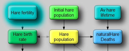
You can control the appearance of each nodes, with bevels, shadows, and highlights, by setting these in the CloudPlayerStyles for the model. By default (for now) ACP displays nodes without these effects, similar to Desktop Analytica, looking rather flat like this:
Node_drop_shadow:yes -- Setting this flag, displays a drop shadow behind each node, giving a kind of 3-D effect:
Bevel_node_border:yes -- Setting this flag, displays a bevel border for each node, giving another kind of 3-D effect:
Glow_hover_highlight:yes - Set this flag to show a "glowing" highlight around each node when you move the cursor over a node.
Glow_hover_highlight:no. Switches off this behavior, which is the default behavior in ACP
Here is the glow hover effect on a node, along with Drop shadow and Beveled border effects.
These effects are new and are still somewhat experimental, so, they are off by default. You are welcome to try them out, by setting CloudPlayerStyles for the main model. Eventually, these effects may become the default. Then you'll be able to turn each one off using Node_drop_shadow: No, Bevel_node_border:No, and Glow_hover_highlight: No.
Node Level Settings
These style flags and options apply to individual nodes (variables), rather than the model as a whole. So, you set these flags on the CloudPlayerStyles for selected objects (nodes).
Input nodes
- textalways - Usually in ACP and Desktop Analytica, to enter a text value into a user input node you have to enclose it in quotes. Insert this flag into the CloudPlayerStyles for each Input node if you want it treat the input as text without requiring the user to use quotes. Note this flag is inserted into the Formnode's CloudPlayerStyles attribute and cannot be done in the Object window or attribute panel. Instead figure out what the identifier of the formnode is and then set the CloupPlayerStyles in the typescript window.
- tabindex:n - In ACP and Desktop Analytica, the user can press tab to go to the next input control to enter its input. You can control the tab order -- the sequence followed by tabbing through inputs -- by adding this flag. Put tabindex:1 into the CloudPlayerStyles of the first one. Put . The tabindex:2 into the second, and so on. Note this flag is inserted into the Formnode's CloudPlayerStyles attribute and cannot be done in the Object window or attribute panel. Instead figure out what the identifier of the formnode is and then set the CloupPlayerStyles in the typescript window.
Embedded Tables and Graphs
In ACP it is possible to display graphs and tables directly on the diagram. The CloudPlayerStyles can be used to specify the region on the diagram to display these tables or graphs. More on Embedded Tables and Graphs...


Enable comment auto-refresher
Dpaine