Difference between revisions of "Heat maps"
(Created page with "''Requires Analytica 4.6'' image:Bar_HeatMap.png image:Bar_HeatMap2.png The requirements for a heat map are * The indexes for both axes must be categorical. * Th...") |
|||
| Line 4: | Line 4: | ||
[[image:Bar_HeatMap2.png]] | [[image:Bar_HeatMap2.png]] | ||
| + | = Requirements = | ||
The requirements for a heat map are | The requirements for a heat map are | ||
* The indexes for both axes must be categorical. | * The indexes for both axes must be categorical. | ||
| Line 9: | Line 10: | ||
The indexes and the value must each contains no more than 30 distinct values. In the above graphs, the value contains only five distinct values. | The indexes and the value must each contains no more than 30 distinct values. In the above graphs, the value contains only five distinct values. | ||
| + | |||
| + | = Preparing your result variable = | ||
In the above graph, correlation is a continuous quantity, but to create the heat map, it had to be mapped to five discrete categories first. To do this, an index named <code>Color_range</code> was created with the five labels. | In the above graph, correlation is a continuous quantity, but to create the heat map, it had to be mapped to five discrete categories first. To do this, an index named <code>Color_range</code> was created with the five labels. | ||
| Line 27: | Line 30: | ||
When you create a heat map, you are actually graphing textual (or at least categorical) labels. | When you create a heat map, you are actually graphing textual (or at least categorical) labels. | ||
| + | |||
| + | = Configuring the graph = | ||
Once you have a result that satisfies the requirements, you can create the heat map graph as follows. | Once you have a result that satisfies the requirements, you can create the heat map graph as follows. | ||
| Line 35: | Line 40: | ||
#. Bring up graph setup again and click the '''Axis Ranges''' tab. Check '''Categorical''' for both axes. Press '''Apply'''. | #. Bring up graph setup again and click the '''Axis Ranges''' tab. Check '''Categorical''' for both axes. Press '''Apply'''. | ||
| + | = Configuring colors = | ||
| + | |||
| + | You will most likely want to customize the colors of your heat map. To do so, right-click on any block and select '''Change Color Series...'''. From that dialog, customize the colors as desired. In most cases, you will probably want to leave the default as "General color sequence, this graph only.". | ||
| + | |||
| + | '''To do: encapsulating in a graph style template''' | ||
| + | |||
| + | = Download an example = | ||
Download a [[media:Heat map.ana|Heat map.ana]] example model. | Download a [[media:Heat map.ana|Heat map.ana]] example model. | ||
Revision as of 22:04, 24 February 2015
Requires Analytica 4.6
Requirements
The requirements for a heat map are
- The indexes for both axes must be categorical.
- The value depicted by color must be categorical.
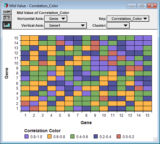
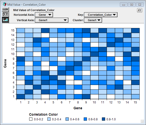
The indexes and the value must each contains no more than 30 distinct values. In the above graphs, the value contains only five distinct values.
Preparing your result variable
In the above graph, correlation is a continuous quantity, but to create the heat map, it had to be mapped to five discrete categories first. To do this, an index named Color_range was created with the five labels.
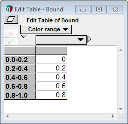
And a table was created with the lower bound of each range.
You then use this to discretize the continuous correlation using StepInterp.
StepInterp( Bound, Color_range, Abs(Correlation_matrix), Color_range, leftLookup:true )
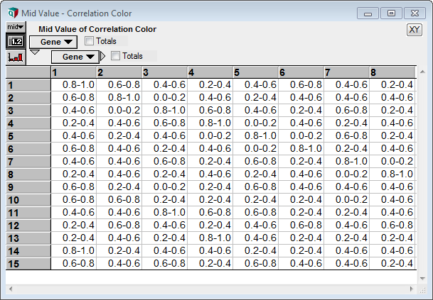
The result is a 2-D array of labels.
When you create a heat map, you are actually graphing textual (or at least categorical) labels.
Configuring the graph
Once you have a result that satisfies the requirements, you can create the heat map graph as follows.
- . Show the result graph
- . Double-click on the graph to go to graph setup.
- . Select Bar style. Set Overlap to 100%. Click Apply.
- . Set Key to be your main value. Set the Horizontal Axis and Vertical Axis to the two indexes.
- . Bring up graph setup again and click the Axis Ranges tab. Check Categorical for both axes. Press Apply.
Configuring colors
You will most likely want to customize the colors of your heat map. To do so, right-click on any block and select Change Color Series.... From that dialog, customize the colors as desired. In most cases, you will probably want to leave the default as "General color sequence, this graph only.".
To do: encapsulating in a graph style template
Download an example
Download a Heat map.ana example model.
See Also
- Mini-Tutorials where other esoteric graph types are described.


Enable comment auto-refresher