Difference between revisions of "Graphing Examples"
(Added link to Analytica User Forum) |
m (removed space after header) |
||
| (9 intermediate revisions by 2 users not shown) | |||
| Line 1: | Line 1: | ||
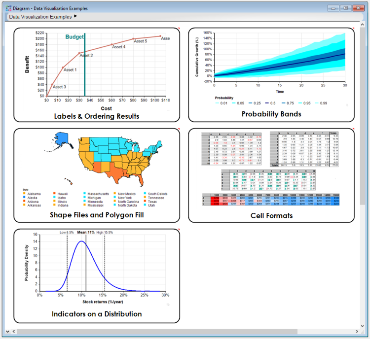
| − | + | The [https://downloads.analytica.com/Bfilstrup/Advanced_Visualization_Examples_Jun2023.ana Data Visualization Examples.ana] model shows off several displays from cell formatting to maps and much more between. | |
| − | + | <br ><br > | |
<center> | <center> | ||
:[[image:Data_Visualization_Examples.png|750px]] | :[[image:Data_Visualization_Examples.png|750px]] | ||
| Line 7: | Line 7: | ||
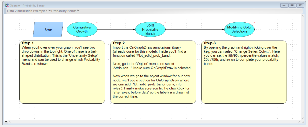
Creating custom graphs is often underutilized due to its syntax being unconnected to any other programming languages. Given this and rising demand for [[Analytica Cloud Platform (ACP)]] models, it only made sense to create a comprehensive model that took several commonly requested displays with detailed step-by-step instructions so that users can confidently extend what they learn from this model into their own models. | Creating custom graphs is often underutilized due to its syntax being unconnected to any other programming languages. Given this and rising demand for [[Analytica Cloud Platform (ACP)]] models, it only made sense to create a comprehensive model that took several commonly requested displays with detailed step-by-step instructions so that users can confidently extend what they learn from this model into their own models. | ||
| + | <br><br /> | ||
<center> | <center> | ||
| Line 12: | Line 13: | ||
</center> | </center> | ||
| − | Only want to recreate on specific feature? No problem. With the [ | + | <br><br /> |
| − | + | Only want to recreate on specific feature? No problem. With the [https://downloads.analytica.com/Bfilstrup/Advanced_Visualization_Examples_Jun2023.ana Data Visualization Examples.ana] model we made it a point to breakdown complex graphs into multiple digestible parts to create an easier learning experience. | |
| + | <br><br /> | ||
<center> | <center> | ||
| − | :[[image:Data_Visualization_Examples_Labels_Ordering_Results.png| | + | :[[image:Data_Visualization_Examples_Labels_Ordering_Results.png|750px]] |
</center> | </center> | ||
| + | |||
| + | === Contents === | ||
| + | When you open the '''Graphing examples library''', you'll see the following example graphs, each contained in their own module: | ||
| + | {| class="wikitable" | ||
| + | |+Summary of Graphing examples | ||
| + | |[[File:Labels and ordering results example.png|450x450px]] | ||
| + | |||
| + | |||
| + | '''Labels and Ordering Results''' | ||
| + | |||
| + | * ''CanvasDrawLine()'' and ''CanvasDrawText() f''unction: Adding a vertical budget line | ||
| + | * ''Plot_point_labels()'' function: Adding labels to graphs | ||
| + | * Starting the graph at the origin | ||
| + | |[[File:Probability bands example.png|450x450px]] | ||
| + | |||
| + | |||
| + | '''Probability Bands''' | ||
| + | |||
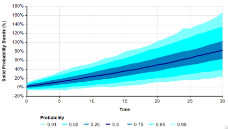
| + | * ''Plot_solid_prob_band()'' function: Creating solid probability bands | ||
| + | * Changing band colors | ||
| + | |- | ||
| + | |[[File:Shape files and polygon fill example.png|450x450px]] | ||
| + | |||
| + | |||
| + | '''Shape Files and Polygon Fills''' | ||
| + | |||
| + | * Drawing shapes | ||
| + | * Filling in shapes | ||
| + | * Setting shape fill colors based on data values | ||
| + | |[[File:Cell formats example.png]] | ||
| + | |||
| + | |||
| + | '''Cell Formats''' | ||
| + | |||
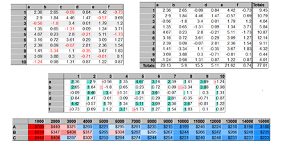
| + | * ''CellFormat('') function | ||
| + | * ''CellFill()'' function: Alternating row colors | ||
| + | * ''CellFont()'' function: Custom text color based on cell value | ||
| + | * ''CellSpan()'' and ''CellBorder()'' functions: Custom borders on rows and columns | ||
| + | * ''CellBar()'' function: Filled bars based on cell value | ||
| + | * ''Fill_Cells_ColorGrad()'' function: Conditional formatting cells with gradients based on values | ||
| + | |- | ||
| + | |[[File:Indicators on a distribution example.png|450x450px]] | ||
| + | |||
| + | |||
| + | '''Indicators on a Distribution''' | ||
| + | |||
| + | * ''Plot_axis_thresholds()'' function: Adding vertical distribution indicators | ||
| + | | | ||
| + | |} | ||
Can't find what you're looking for or have a contribution to make? Let us know at the [https://lumina.com/community/main-category/ Analytica User Forum] and help guide this evolving library! | Can't find what you're looking for or have a contribution to make? Let us know at the [https://lumina.com/community/main-category/ Analytica User Forum] and help guide this evolving library! | ||
| + | <br><br /><br /> | ||
Latest revision as of 01:13, 20 October 2023
The Data Visualization Examples.ana model shows off several displays from cell formatting to maps and much more between.
Creating custom graphs is often underutilized due to its syntax being unconnected to any other programming languages. Given this and rising demand for Analytica Cloud Platform (ACP) models, it only made sense to create a comprehensive model that took several commonly requested displays with detailed step-by-step instructions so that users can confidently extend what they learn from this model into their own models.
Only want to recreate on specific feature? No problem. With the Data Visualization Examples.ana model we made it a point to breakdown complex graphs into multiple digestible parts to create an easier learning experience.
Contents
When you open the Graphing examples library, you'll see the following example graphs, each contained in their own module:
Can't find what you're looking for or have a contribution to make? Let us know at the Analytica User Forum and help guide this evolving library!


Enable comment auto-refresher